")

Navy Blue + White + [metallic accent]

Blue and white has always been easy to master and a universal favourite.
But adding a hint of either black/gold/silver contemporises and sharpens the palette (gold/brass is my fav, adding warmth too). Off-white usually works best with navy. Add contemporary pattern, for interest, as shown in this Harlequin fabric. and wallpaper to the left.


Grey-blue + Charcoal + [hint of pink/red/crimson]

I’ve long been a fan of grey-blues – but alone they can look lifeless. Adding Charcoal adds depth. But what really livens up this palette is an accent of pink, crimson or red (this can be subtle or powerful). This accent can be a simple vase of flowers or cushion – to a large rug or armchair.


Yellow + Blue + Pink
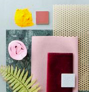
This is such a happy palette (it’s the colours of my living area at present!) yet it can also be super sophisticated. It works beautifully in a white-walled room (just add these colours in cushions and art). But these colours work beautifully for furniture too. Alternatively, paint all of the walls one colour, use another for a rug, and another for the settee.
You can go DEEP or LIGHT or even a little fluorescent with these colours … just keep the intensity the same across the hues. Fabulous new wallpaper from James Dunlop shown bottom right.


Blue + Orange

Another oldy but a goody. Sometimes when working with a client who has rich wooden furniture, teaming this furniture with dusky blue walls con temporises the colour of the wood. Alternatively, a lovely fresh take on blues and oranges that I’m loving right now is using the orange as the accent to a soft blue-grey. Villa Nova fabrics in these two images illustrate how it’s done.


Pink + green [or Blush + Olive]

Green and pink is an outstanding complementary colour duo.
A fabulous take on this pairing is Blush and Olive. Here, Casanova fabric teams these tones superbly using geometric patterns, and then warms up it up with a little yellow. Below right, Malcolm Fabrics show this colour combo in Wallpaper. Designers Guild below left shows blush and olive at its best (one of my favourite new season wallpapers just released). Bottom right using sharper tones by Vogue Australia.


Monochromatic [in virtually any colour]

Think tone on tone – soft blue with deeper blue… pale leaf with forest green… dusky pink with burgundy. It’s almost foolproof. Just ensure you add plenty of neutral white and a little depth of tone using charcoal or black. James Dunlop Hanna Weaves features in this green scheme. Warwick Lenora feature in the blue scheme. Artisan showing how to do pink and red. Note in all three the depth of colour with black to ground the colour and the use of neutral white.


Aqua/Teal/Blue + Coral/Brown/Tan

Blue and Brown. These colours sound drab in print. But this is a timeless and fabulously stylish combo. Blues, especially aqua or teal, are favourites of many of my clients, but used poorly can look dated. To contemporise, use earthy tones of both. This lends itself to either a pretty look or a sophisticated mid-century take. Images here show a simple dried flower arrangement against James Dunlop’s Aylin Fabric (top right). Mokum fabric features in a smudgy green here against wooden furniture (bottom left). CC Interiors new range features these tones beautifully (below right).


